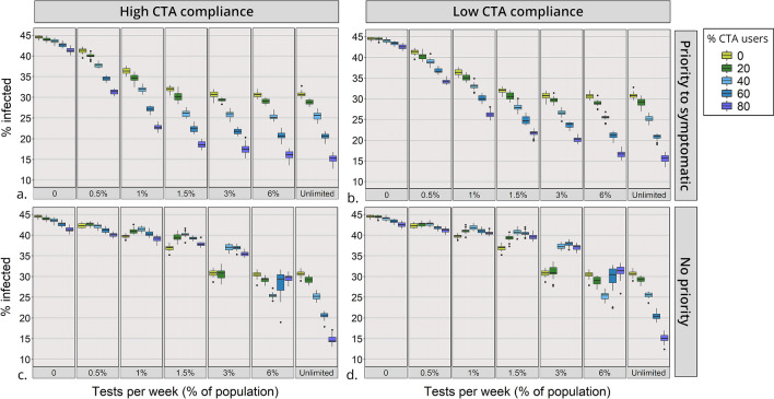
Figure 4.
Percentage of the population infected during the course of epidemic. Scenarios vary by testing capacity (x-axis) and percentage of CTA users (boxplot’s colour). Diagrams are organized by testing policy and compliance with self-isolation of CTA users: (a) High compliance and priority for testing symptomatic cases; (b) Low compliance and priority for testing symptomatic cases; (c) High compliance and no priority for testing symptomatic cases; (d) Low compliance and no priority for testing symptomatic cases. The boxplots show the median and interquartile range of multiple simulation runs.

