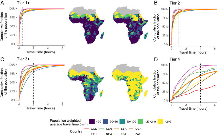
Fig. 1.
Accessibility to the nearest public health care facility (in travel hours), by facility tier (Tier 1 or higher, Tier 2 or higher, Tier 3 or higher, Tier 4). A–D display for Tiers 1+ to 4, respectively, 1) the classification of public health care facilities into the four tiers; 2) population-weighted travel time required to reach—from each 250-m-resolution point—the nearest public health care facility of Tier K or higher accounting for the local travel possibilities [including roads, railways, and physical barriers (30); note that Tier 1 facilities data are unavailable for Niger, Guinea-Bissau, and eastern Angola]; and 3) empirical cumulative distribution curves of the population’s accessibility to the nearest public health care facility in selected countries and the entire sub-Saharan African region (in orange). The x axis describes the travel time to public health care in minutes for Tier K or higher. The y axis describes the cumulative fraction of the population that is living within the travel time of the corresponding x value. The curves thus describe three dimensions of inequality: inequality between the countries in each tier, inequality within each country in each tier, and inequality in accessing health care facilities between the four tiers. Black dashed lines describe the accessibility time thresholds considered in this study. International Organization for Standardization codes: COD, Democratic Republic of the Congo; ETH, Ethiopia; KEN, Kenya; NGA, Nigeria; TZA, Tanzania; UGA, Uganda; ZAF, South Africa.

