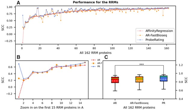
Fig. 4.
Performance of ProbeRating compared to AffinityRegression on the RRM162 dataset. (A) Each dot represents the SCC between the predicted and true RNAcompete probe intensities for a protein. The solid blue line indicates the performance of ProbeRating with the FastBioseq embedded features (PR), the dashed red line indicates the original AffinityRegression with its k-mer frequency features (AR) and the dotted yellow line indicates feeding AffinityRegression with the FastBioseq embedded features (AR-F). Proteins in the x-axis are sorted in ascending order based on their original AffinityRegression’s SCCs. (B) Similar plot to (A), zoom in on the first 15 proteins. (C) Boxplot for the performance of the three methods for all 162 RRM proteins. In each box, the dashed white line denotes the mean, and the solid green line denotes the median. The significance bar represents the P-value from a two-tailed Wilcoxon signed-rank test, with *** P < 0.001

