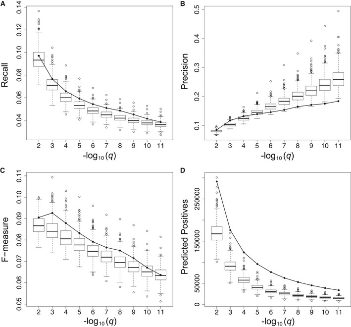
Figure 5. Global gene function prediction performance.

-
A–DPanels (A) to (D) depict the gene function prediction performance of the single‐plant network (solid line) and 500 sampled SRA networks (box‐and‐whisker plots) averaged across all genes in a given network. Boxes extend from the 25th to the 75th percentile of the sampled networks, with the median indicated by the central black line. Whiskers extend from each end of the box to the most extreme values within 1.5 times the interquartile range from the respective end. Data points beyond this range are displayed as open black circles. Panels (A), (B), and (C), respectively, represent the recall, precision, and F‐measure of the network‐based gene function predictions as a function of the prediction FDR threshold (q). Panel (D) depicts the number of gene functions predicted from each network (predicted positives = true positives + false positives) as a function of the prediction FDR threshold. As multiple gene functions can be predicted per gene, the number of predicted positives is generally higher than the number of genes.
