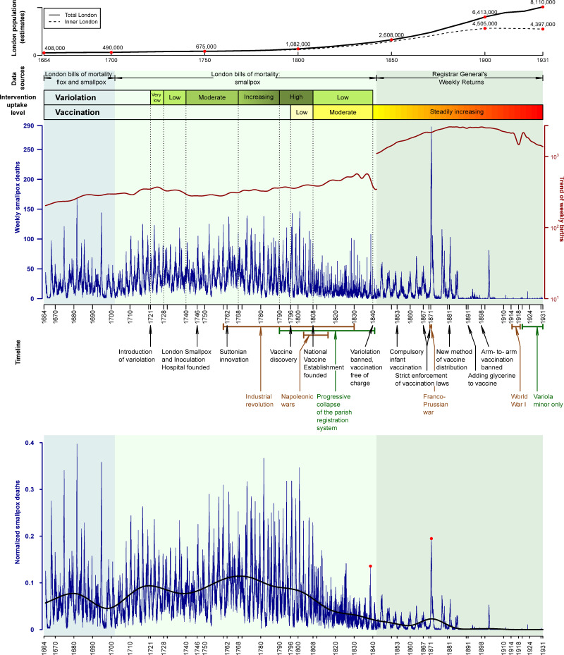
Fig 3. London’s population and weekly smallpox deaths, 1664–1930, against the timeline of historical events related to the history of smallpox in England.
The top of the graph shows the population of inner London (dashed) and all of London (solid) as estimated in the London’s population subsection of Data in the main text. The main panel shows weekly smallpox deaths in London in blue and the long-term trend of weekly births in red. Background shading indicates different sources and classifications of disease: 1664–1701, flox and smallpox burials from the London Bills of Mortality (LBoM); 1701–1841, smallpox burials from the LBoM; 1842–1931, smallpox deaths from the Registrar General’s Weekly Returns (RGWRs). The geographical area covered by the RGWR was larger than for the LBoM (see Data for details). Qualitative variolation and vaccination uptake levels are shown with colored bars. Annotation below the main panel shows the timeline of historical events related to smallpox history in England: Black text indicates events that influenced uptake of control measures; brown text indicates events that influenced human behavior; and dark green text is used to highlight reduced data accuracy during the last few decades of the LBoM. The bottom panel shows weekly smallpox deaths normalized by the long-term trend of all-cause deaths (see Fig 4). The trend of normalized smallpox deaths is also shown (heavy black curve). Trends were estimated by Empirical Mode Decomposition (see Methods). Red dots highlight the peaks of the epidemics of 1838 and 1871, the most significant smallpox epidemics of the 19th century. The data and R script required to reproduce this figure are available at https://github.com/davidearn/London_smallpox.

