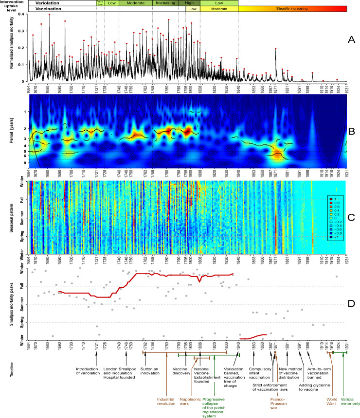
Fig 6. Spectral structure and seasonality of smallpox dynamics in London, England, 1664–1930.
Panel A: weekly smallpox deaths normalized by the long-term trend of all-cause deaths. The red dots indicate the epidemic peaks, i.e., the highest value of normalized smallpox mortality during the epidemic year (identified by visual inspection). Panel B: wavelet transform of the normalized weekly smallpox mortality time series (square root-transformed and normalized to unit variance). Colors range from dark blue for low power to dark red for high power. Heavy black curves show the local maxima of wavelet power (squared modulus of wavelet coefficients [89]) at each time. Thin black curves show 95% confidence contours, estimated from 1,000 bootstrapped time series generated by the method of [89]. Medium black curves near the left and right edges show the cone of influence [89,92], below which the calculation of wavelet power is less accurate because it includes edges of the time series that have been zero-padded to make the number of time points a power of 2. The wavelet spectrum was computed using MATLAB code kindly provided by Bernard Cazelles. Panel C: seasonal heat map based on the detrended, square-root transformed, normalized smallpox time series (see Seasonality subsection of Methods). Colors indicate the degree of variation from the global mean of the time series (which is 0 after detrending). Panel D: The epidemic peak times (red dots in Panel A) are displayed with gray dots in the year versus time-of-year plane. The red curve shows the moving average peak week, computed using a window of 21 epidemics. As in Fig 3, variolation and vaccination uptake levels are indicated above Panel A, and the timeline of historical events related to smallpox history in England is shown below Panel D. The data and R script required to reproduce this figure are available at https://github.com/davidearn/London_smallpox.

