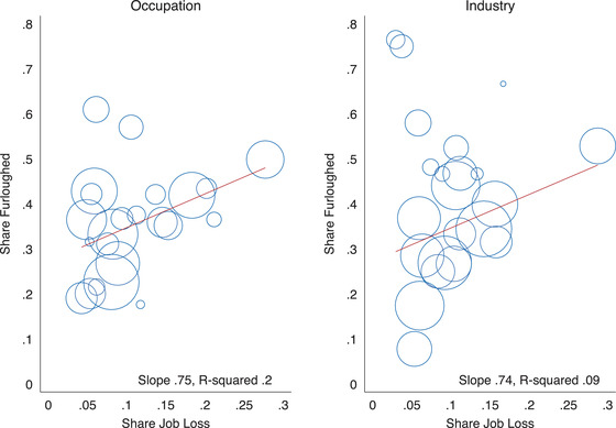
FIGURE 3.

Share of workers furloughed and share that have lost their job across occupations and industries
Note: Each circle represents either an occupation or industry, with the size proportional to the number of survey respondents who report that either their current or last job was in that occupation or industry. The line gives the line of best fit. Survey responses for the April and May survey waves are pooled in this figure.
