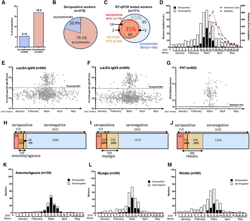
Figure 2.

Temporal distribution of symptoms appearance and serology correlates with COVID‐19 outbreak in France. (A) Seroprevalence among asymptomatic and symptomatic workers. (B) Proportion of asymptomatic and symptomatic seropositive workers. (C) Correlation between symptom reporting (blue circle), serological profile (red circle), and RT‐qPCR result (orange circle) among RT‐qPCR tested workers. Proportion (%) of triple‐positive individuals is indicated in red and RT‐qPCR negative, seronegative among symptomatic workers in blue. (D–G) Temporal distribution of serological test results according to the first symptom onset. (D) Number of workers (left y‐axis) reporting at least one symptom but seronegative (white) or seropositive (black). Curves of intensive care admission and mortality in all Paris hospitals are also plotted (right y‐axis). (E–G) Individual test results according to date of symptom onset. (E) LuLISA IgG/N, (F) LuLISA IgG/S, and (G) PNT. (H–J) Prevalence of symptoms according to serology status. Seropositive workers are represented in red and seronegative in blue. Symptomatic workers are represented in orange/yellow. Number of workers for each area is indicated. Percentage represents the proportion of symptomatic in seropositive (orange area) individuals and symptomatic in seronegative ones (yellow area). (K–M) Prevalence of symptoms during pandemic outbreak according to serology status. Plots represent the number of workers reporting symptoms (y‐axis) per week in 2020 (x‐axis). Only the three most representative symptoms from Table 2 are plotted: Anosmia/ageusia as an example of temporally and clinically correlated to COVID‐19 (H and K), Myalgia as clinically only correlated (I and L), and rhinitis as poorly correlated (J and M).
