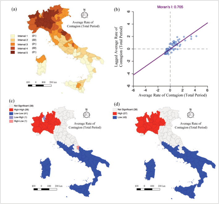
FIGURE 3.

(a) Quintile map of average contagion rate from 24 February to the 30 July at province level, (b) Moran scatterplot, and (c) LISA cluster map (d) hot spot and cold spot by Getis‐Ord G for the average of the total case per day from the 24 February to the 30th of July at province level
