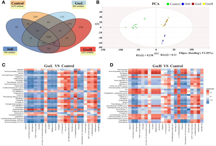
Figure 7.
(A) is a Venn diagram summarizing the numbers of common and unique observed entities in serum metabolome. (B). represents the PCA plot of the broilers’ serum metabolome. (C, D). represent the correlation between significantly changed serum metabolites and the top 30 distinguished cecal bacteria strains (at the genus level) between the GSPE-treated and Control groups. *P < 0.05 **P < 0.01, ***P < 0.001, compared to the Control treatment. N (Control) = 12; N (Anti, GseL, GseH) = 10.

