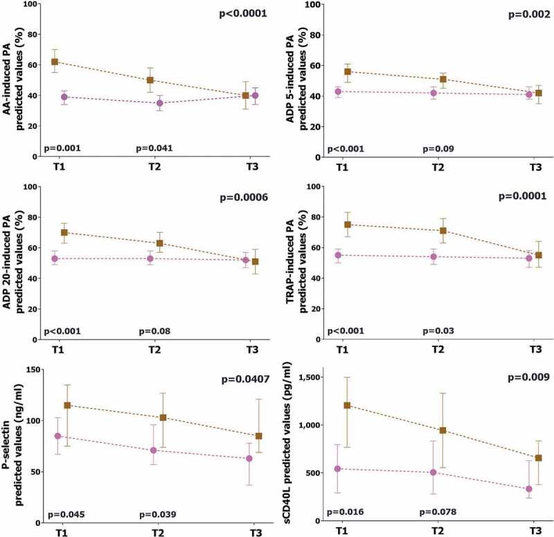
Figure 3.

Comparison of platelet biomarkers in survivors vs. non-survivors
The graphs represent the marginal effect plots. The squares and the circles represent the marginal effect at the specific time point. The whiskers are the 95%CI. The lines between squares and circles represent the trend over time. The p-value in the upper right portion of each figure represents the overall difference over time between subgroups. The p-values in the lower portion of each figure represent the difference in the single time point.Brown line and square: non-survivors. Pink line and circle: survivors.AA: arachidonic acid. ADP: adenosine diphosphate. TRAP: thrombin receptor agonist peptide. sCD40L: soluble CD40 ligand.
