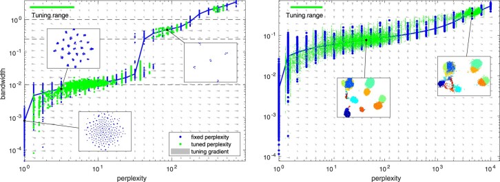
Fig. 3.
Perplexity versus bandwidth with fixed and automatic perplexity selection. Left panel: an artificial dataset of 10-D hierarchically normal data with five clusters with five subclusters each. The blue dots visualize the effective bandwidth (the chosen σi parameter) for each sample with the blue curve showing their median. Meanwhile, the green dots visualize the effective perplexity versus the effective bandwidth for each sample when the perplexity is automatically tuned by a factor of [2–1, 2]. The gray arrows indicate the estimated gradient field for the perplexity tuning process. The dashed black lines indicate the true bandwidths in the generated data. Visualizations of the resulting mappings are shown in insets. Right panel: the corresponding plot for Levine data downsampled to 15 000 samples. (Color version of this figure is available at Bioinformatics online.)

