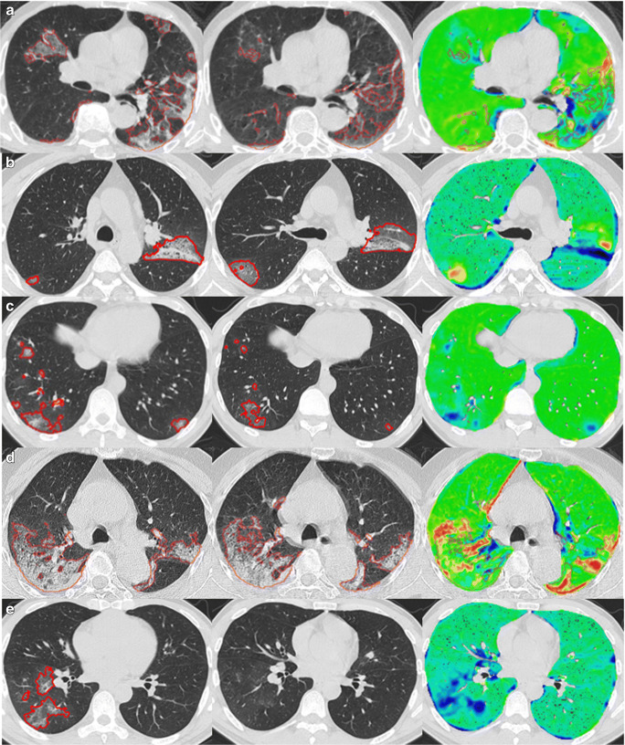
Fig. 5.
Examples demonstrating the visualization of disease progression by subtracting the identified regions of interest on the T0 CT scans from the T1 CT scans. The left panel is the original T0 (baseline) CT scan. The middle panel is the original T1 (follow-up) CT scan. The right panel is the heatmap visualization of disease progression: green regions—limited changes; blue regions—decreased densities from T0 to T1; and yellow and red regions—increased densities from T0 to T1

