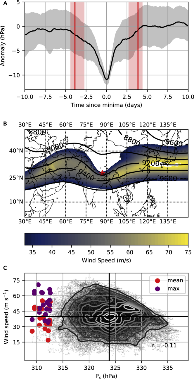
Figure 3.
Episodes of Lowest Air Pressure on Mt. Everest (1979–2019)
(A) Composite mean anomaly (black line) ± standard deviation (gray shading) for the 20 reconstructed events with lowest summit pressure. Red vertical lines mark the mean calculated time since minima for pressure to begin falling away from (negative days), or recover to (positive days), higher values. Calculations are based on wave phase speed, and the shading spans the 25th to 75th percentiles of these estimates (see Methods).
(B) Mean geopotential height of the 300 hPa surface (lines) and mean 250 hPa wind (shading) across the 20 events, with Mt. Everest shown as a red star. Note winds <33 m/s (equivalent to a Category 1 hurricane) are not shown. (C) Scatter cloud shows the relationship between hourly winter (Dec-Feb) summit air pressures and concurrent winds interpolated to Mt. Everest's summit. Contours indicate relative density (white higher density, black lower density), whereas heavy black lines indicate the respective means, and r is the Pearson correlation. The larger colored circles show the mean (red) and maximum (purple) summit wind speed and pressure in a 72-h window centered on each of the 20 events.

