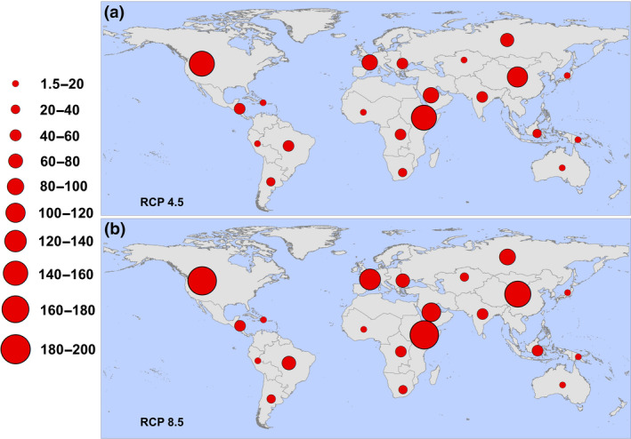
FIGURE 3.

Regional increases in populations at risk for any transmission (one or more months). Regions are defined according to the Global Burden of Disease regions (detailed in Figure S1), and proportional red circles illustrate the regional populations (in millions) at risk under (a) RCP 4.5 and (b) RCP 8.5 [Colour figure can be viewed at wileyonlinelibrary.com]
