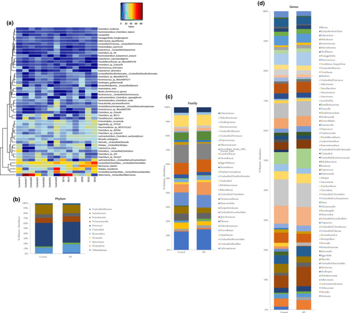
Figure 2.

(a) Heatmap showing quantitative visualization of microbial community composition. Rows of the generated heatmap represent taxa; columns represent samples. Both are ordered by hierarchical clustering. Taxa abundances are presented in a colour code, ranging from red (highly abundant) to blue (rare or absent). Values of explanatory variables are presented as a separate heatmap on top of the main heatmap. Stacked bar graphs showing altered gut microbiota composition on (B) phylum, (c) family and (d) genus levels, respectively
