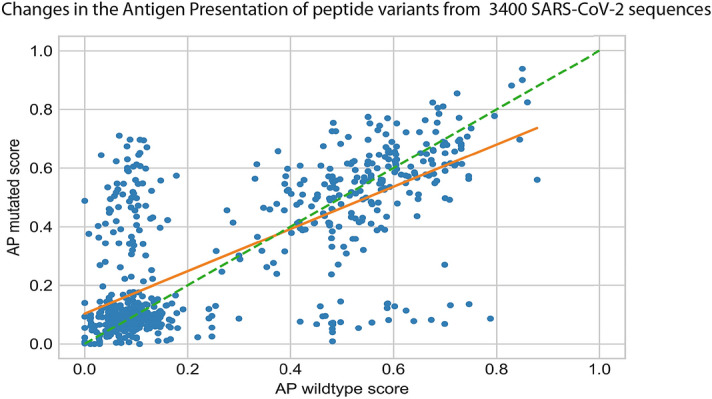
Figure 4.

The scatter plot shows the mutated AP score (Y-axis) against its wildtype AP score (X-axis) for each peptide variant. Each data point (blue circles) represents a peptide variant identified in a SARS-COV-2 sequence when comared to the Genbank (Wuhan) reference sequence. There was a total of 1122 peptide variants identified in such a comparison and illustrated on the plot. The orange line is a least square fit with slope = 0.72. Peptide variants on the green dashed line of slope 1 would show no change in AP after introduction of the peptide variant.
