
Fig. 2.
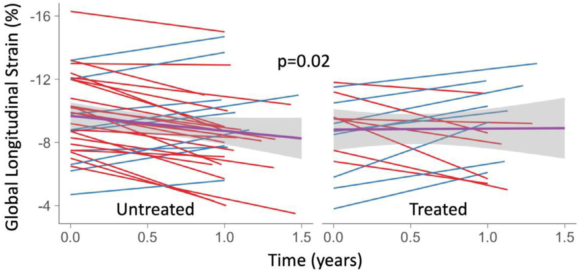
Spaghetti plot of GLS over time for ATTRwt patients untreated (left) and treated (right) with diflunisal. Blue lines indicate improvement and red lines indicate decline in GLS over time. A linear model of changes between baseline and follow-up compared between treated and untreated patients is displayed (black line) with a 95% CI (grey).