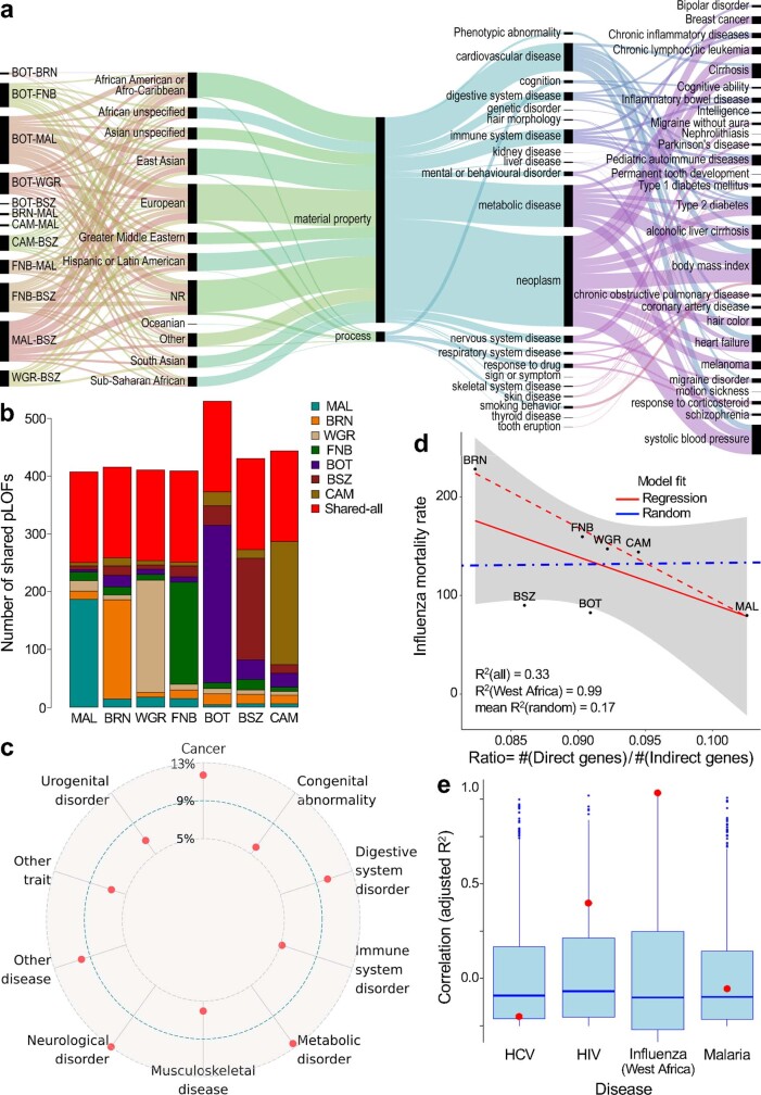
Extended Data Fig. 3. Highly divergent and putative LOF variants.
a, EFO traits from the GWAS catalogue reflected by highly divergent SNVs within 50 kb of GWAS hits. From left to right, ribbons illustrate the relative representation of variants across pairwise population comparisons, GWAS ancestry, EFO top label, EFO trait or disease label, and disease or traits mapped to the EFO label. b, Distribution and sharing of common (MAF > 5%) putative LOF variants between two or more populations (coloured bars) and between all populations surveyed (red bars). c, Specific disease classes to which 5% or more genes with putative LOF variants shared between all populations were mapped. d, Correlation (Pearson) between WHO mortality rates for influenza and ratio of putative LOF variants in direct (n = 181) compared with indirect (n = 1842) influenza-associated genes (red solid line, all populations; red dotted line, west African populations). The blue dotted line represents the mean correlation for the same correlations generated using 1,000 permutations of random genes; the s.e.m. for all populations is shown in grey. e, Correlation statistics (adjusted R2) for the putative LOF ratio for genes related to hepatitis C (HCV, n = 190 direct genes, n = 1837 indirect genes), HIV(n = 724 direct genes, n = 1351 indirect genes), influenza in west African countries (CAM, MAL, FNB and BRN), and malaria (n = 484 direct genes, n = 1554 indirect genes) are shown as red dots against the box plot distributions of correlation statistics (adjusted R2) generated using 1,000 permutations of random genes (Supplementary Table 18). Box plots show the median value (centre line), whiskers indicate the limits of the highest (fourth) and lowest (first) quartiles of the data; distribution outliers are shown as dots.

