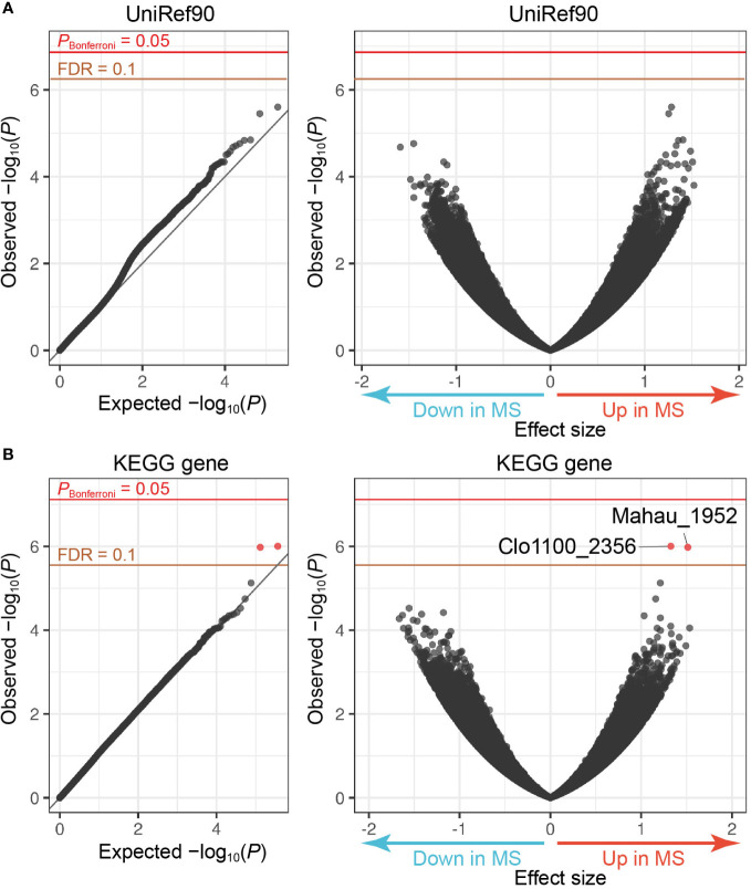
Figure 2.
MWAS results of MS case-control gene association tests. (A) A quantile-quantile plot (left) and a volcano plot (right) of the MWAS P-values of genes based on the UniRef90 protein database. (B) A quantile-quantile plot (left) and a volcano plot (right) of genes based on the KEGG gene database. In the quantile-quantile plots, the x-axis indicates empirically estimated median -log10 P-values. In the volcano plot, the x-axis indicates beta of generalized linear model as effect sizes. The y-axis in both plots indicates observed -log10 P-values. The diagonal gray line represents y = x, which corresponds to the null hypothesis. The horizontal red line indicates the empirical Bonferroni-corrected threshold (α = 0.05), and the brown line indicates the empirically estimated (FDR-q = 0.1). Genes with FDR-q < 0.1 are plotted as red dots, and other genes as black dots.

