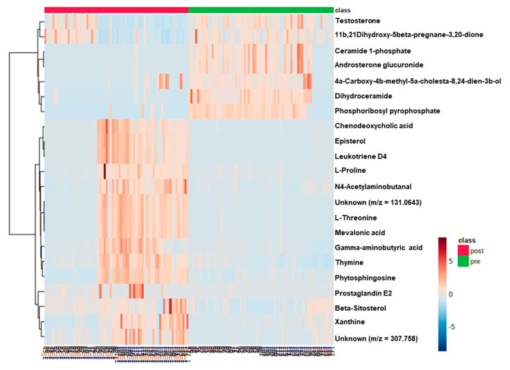
Figure 2.
Heatmap of the 22 differentially accumulated metabolites. The heatmap provides a visualization of the changes in the abundance of metabolites specified in each row (normalized by log 10 scale). The color ranges from deep orange, indicating high abundance, to deep blue, indicating low abundance. On the top of the heatmap, green bars and red bars indicate pre-operative and post-operative patients with colorectal cancer, respectively.

