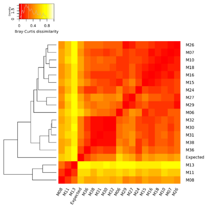
Figure 2.
Heat map of Bray–Curtis dissimilarity and average linkage clustering dendrogram showing the similarity between the benchmark (expected) and the DNA metagenomic datasets obtained from spiked salmon, considering the microorganisms of the mock community. In the heat map, when a cell is colored in red, it indicates that the two associated samples (in the corresponding row and column) have an identical composition, while a white cell refers to two samples with the most different composition.

