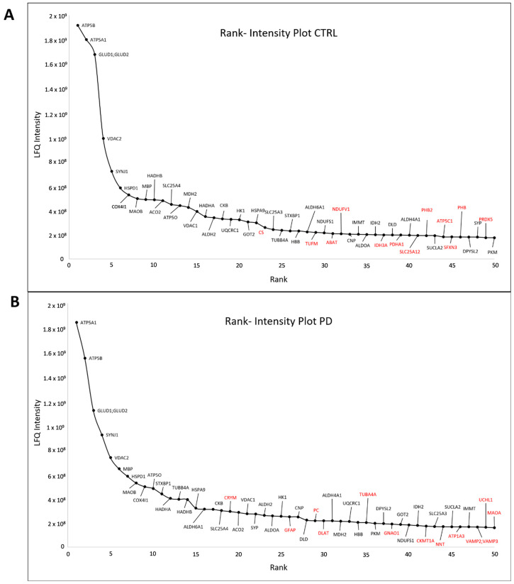
Figure 3.
Rank–intensity plot for (A) CTRL and (B) PD. The mean of LFQ intensities for each protein in each group was calculated. Proteins were subsequently ranked from highest to lowest LFQ intensity. The top 50 proteins were plotted against their intensities. Each protein is marked using the gene name. Proteins being in the top 50 in one group only (either CTRL or PD cases) are marked in red.

