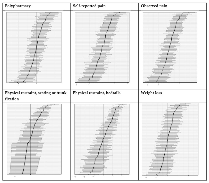
Figure 1.
Caterpillar plots based on empirical Bayes estimates of the six quality indicators. In each plot, the horizontal lines represent the nursing homes: the dot in the middle of each line represents the percentage of nursing home residents to whom the quality indicator applies; the whiskers represent the 95% confidence interval (CI). The vertical line represents the (standardized, i.e., centered to 0) sample mean of the specified quality indicator. If the whiskers (i.e., the CI) do not touch the vertical line (i.e., the mean), the result of the nursing home in the quality indicator specified (e.g., the percentage of residents with weight loss in this nursing home) differs significantly from the sample mean (e.g., the mean percentage of residents with weigh loss across all nursing homes). Lower-performing nursing homes with quality indicator values above the mean, e.g., more residents with weight loss, are on the top-right side of the plot. Those with quality indicator values below the mean, e.g., fewer residents with weight loss, are on the negative (lower left) side of the plot. If the CI touches the sample mean, the nursing home’s result does not differ significantly from the mean.

