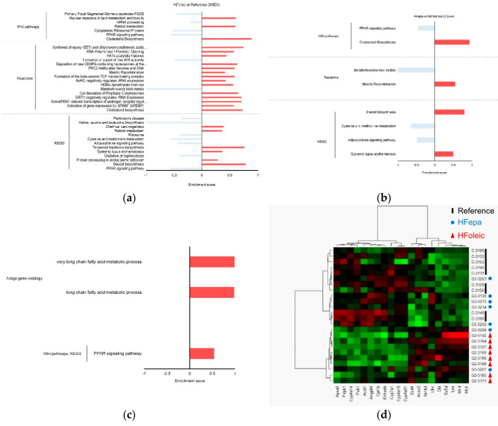
Figure 3.
Gene set enrichment analysis of differentially expressed genes between conditions. (a) Histogram showing the enriched pathways in HFoleic condition vs. reference. (b) Histogram showing the enriched pathways in HFepa condition vs. reference. (c) Histogram showing the enriched pathways in HFepa condition vs. HFoleic condition. In panels (a)–(c), the red bars represent over representation of corresponding pathway or reaction; blue bars represent under representation of corresponding pathway or reaction. (d) Heat map visualization of expression data of the genes involved in peroxisome proliferator-activated receptor (PPAR) and Cholesterol pathways. The color code indicates the expression level of each genes and for each sample (green, low expression level; red, high expression level). The genes are represented as columns and the samples with the identification of group correspondence as rows.

