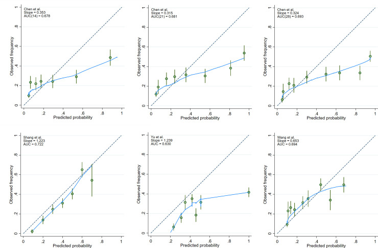
Fig 2. Calibration plots.
The green circles denote point estimates and the green vertical lines 95% confidence intervals for risk groups. Fewer than 10 groups in a plot indicate absence of cases in decile risk groups. The dashed line represents a perfect agreement between observed and expected mortality estimates. The blue line indicates the fitted loess curve. (A-C) represent the calibration plots generated from Chen et al. (D) represents the calibration plot generated from Shang et al. (E) denotes the calibration plot generated from Yu et al. (F) illustrates the calibration plot generated from Wang et al.

