Figure 1.

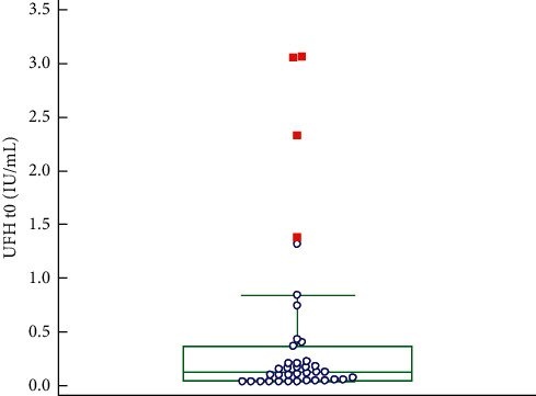
Box and Whisker plot UFH concentrations at the start; red squares represent far out values (>upper quartile +3 times the interquartile range).

Box and Whisker plot UFH concentrations at the start; red squares represent far out values (>upper quartile +3 times the interquartile range).