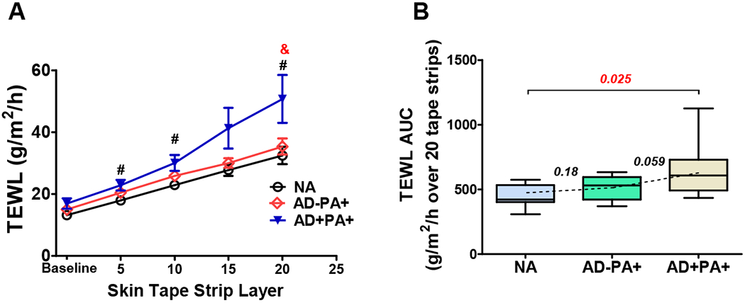
Figure 1. TEWL and TEWL AUC after sequential STS by group.

(A) TEWL measurements at the baseline and after 5, 10, 15, and 20 STS. The line figure represents Mean±SE for TEWL measurements at each STS layer (black line represents NA, red line represents AD−PA+, and blue line represents AD+PA+ groups). #,& - significant differences (p<0.05) between AD+PA+ and NA (#) or between AD+PA+ and AD−PA+ (&). (B) TEWL AUC box plots: here and in all subsequent figures, the box margins are the 25-75%-interquartile range (50% of the observations), whisker lines are minimal and maximal observations, and the annotations are the p values from one-way ANOVA with the multiple comparison analysis.
