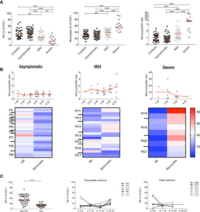
Figure 2.
(A) Plots indicate the frequency of NK, monocytes and MNKR ratio in all analyzed samples collected at different time points. (B) Graphs depict the kinetics of the MNKR during the first 6 weeks of disease (midlines indicate mean) in all patients samples. Data referring to severe patients has a different scale due to the high value of MNKR. Heatmaps show the percentage of NK and monocytes in patients who had samples collected at different time points during the first 6 weeks. In the heatmap percentages are represented by the different expression of red, blue and white as indicated in the color code. (C) Scatter plot shows the percentage of NK cells in non-ICU (n = 43) and ICU (n = 34) patients. Graphs show the kinetics over time of NK cells percentage in patients with favorable and fatal outcome. (A, C) Midlines indicate median. Statistical significances were determined using unpaired, two-tailed Mann–Whitney U-tests. **p < 0.01, ***p < 0.001.

