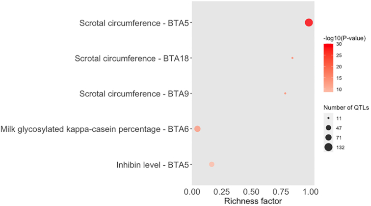
Figure 4:

Bubble plot displaying the enrichment results for the top 5 enriched QTLs identified using the QTLs annotated within the candidate regions from Feugang et al. [15] and Buzanskas et al. [14]. The darker the red shade in the circles, the more significant the enrichment. The area of the circles is proportional to the number of QTLs. The x-axis shows a richness factor obtained by the ratio of the number of QTLs annotated in the candidate regions and the total number of each QTL (and chromosome in the case of this plot) in the reference database.
