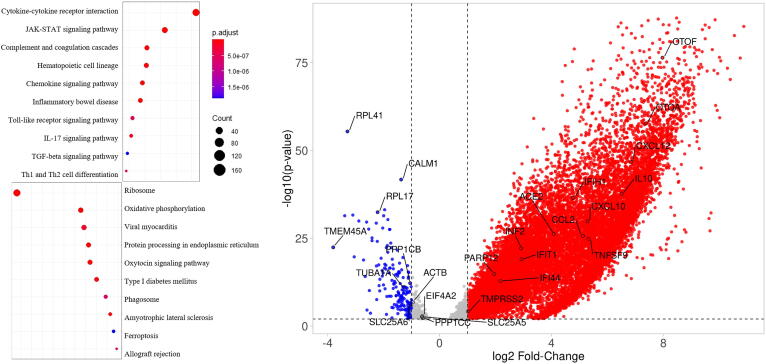
Fig. 2.
Left, Dotplot visualization of enriched Pathway terms in all COVID-19 patients. The color of the dots represents adj p-value for each enriched pathway, and size represents the percentage of genes enriched in the total gene set. Right, Volcano plot representing upregulated and downregulated genes. X-axis represents log2 fold change of genes and Y-axis represents –log10P-value in differentially expressed gene (DEG) analysis.

