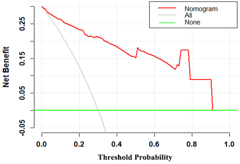
Figure 5.
Decision curve for the MRI-based nomogram. The red line represents the MRI-based nomogram. The gray line represents the hypothesis that all patients had malignant mass. The green line represents the hypothesis that all patients had benign mass. The x-axis represents the threshold probability. The y-axis represents the net benefit.

