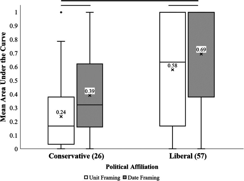
Fig. 3.

Distribution of Participants’ AuC Measures Based on Self-Reported Political Affiliation. Note. The crosses indicate the mean area under the curve (AuC) values. The bold black line indicates a significant main effect of political affiliation (p < 0.001). The less weighted gray lines indicate significant differences between mean AuC values within each group (p < 0.025). Numbers in parentheses indicate the sample size for each group
