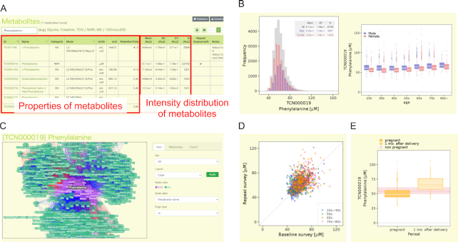
Figure 4.
Overview of the metabolome section in jMorp. (A) Example of the search page of metabolites. The figure shows the metabolite table filtered by the word ‘Phenylalanine’. The left side of the table shows the basic properties of the metabolite, and the information about the concentration distribution of the metabolite is shown in the center. By clicking on the name of a metabolite in the table, users can move to the detailed page of the metabolite. (B) Distributions of the concentration of Phenylalanine (TCN000019) as an example. The plot on the left shows the distribution of the concentration of phenylalanine by gender, and the plot on the right shows that by age. (C) An example of the correlation network view. Nodes and edges on the network correspond to metabolite and correlation between two metabolites, respectively. The colors of the edges indicate the direction of the correlation (red: positive correlation, blue: negative correlation), and opacity of the edges indicate the strength of the correlation. (D) Change of Phenylalanine (TCN000019) concentration of same individual over time (3–4 years). One dot in the plot corresponds to one individual, and the horizontal and vertical axes indicate the concentration of phenylalanine in the first and second measurements, respectively. The dot color indicates the age of the individuals. (E) Difference of metabolite concentration between pregnant or after-birth periods. The two boxplots show the distribution of Phenylalanine (TCN000019) concentrations during pregnancy and one month after delivery, respectively. The distribution of phenylalanine concentration in non-pregnant individuals is shown in pink behind the two boxes.

