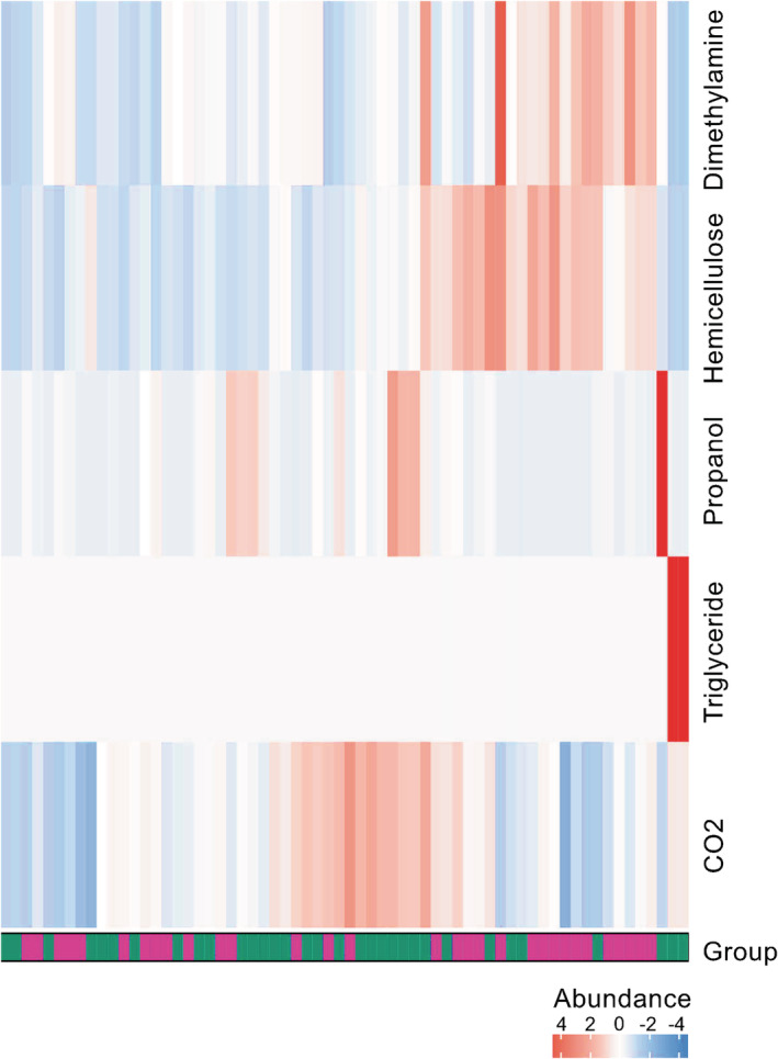
Figure 6.

Heatmap of significantly different metabolites between responders and nonresponders. Heatmap shows differentially abundant metabolites between responders and nonresponders, in which columns represent samples (green = responders, purple = nonresponders) and rows metabolites. The heatmap visualization is used to encode individual abundance of the metabolites for each sample as colors (red, relative enrichment; blue, relative reduction; white, no correlation). Designation of metabolites are indicated on the right hand‐side of the figure  , NR;
, NR;  , R.
, R.
