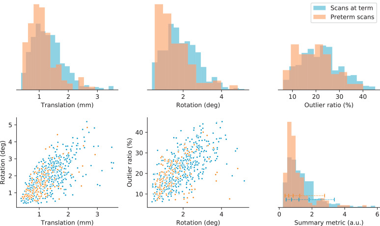
Fig. 4.
Distribution of motion metrics in the preterm and term cohorts. The top row displays normalized histograms of the mean intra-volume translation and rotation (in physical units) and the slice outlier ratio. The bottom left and middle scatter plots show the correlation between these metrics. The bottom right graph displays the histogram of the summary motion metric defined in Section 3.3. We generally detect less motion in the preterm scans. The blue horizontal bar indicates the percentiles within the term group used to select subjects for display in this article.

