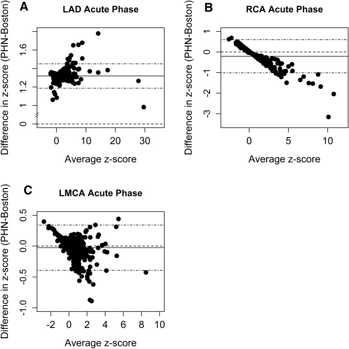
Fig. 1.
Bland–Altman plots for each coronary dimension in the acute phase of illness. X-axis represents the subject-specific average between two z-scores (PHN z-score + Boston z-score/2). Y-axis represents the subject-specific difference of the two z-scores (PHN z-score − Boston z-score). The dashed line intersecting zero on the y-axis indicates the reference value of no discrepancy/bias. The solid horizontal line indicates the mean of the differences. The farther the solid line (average difference) departs from zero, the larger the overall discrepancy between the two z-score systems. Stippled (“dotdash”) lines bound the 95% CI of mean differences

