
Figure 6.
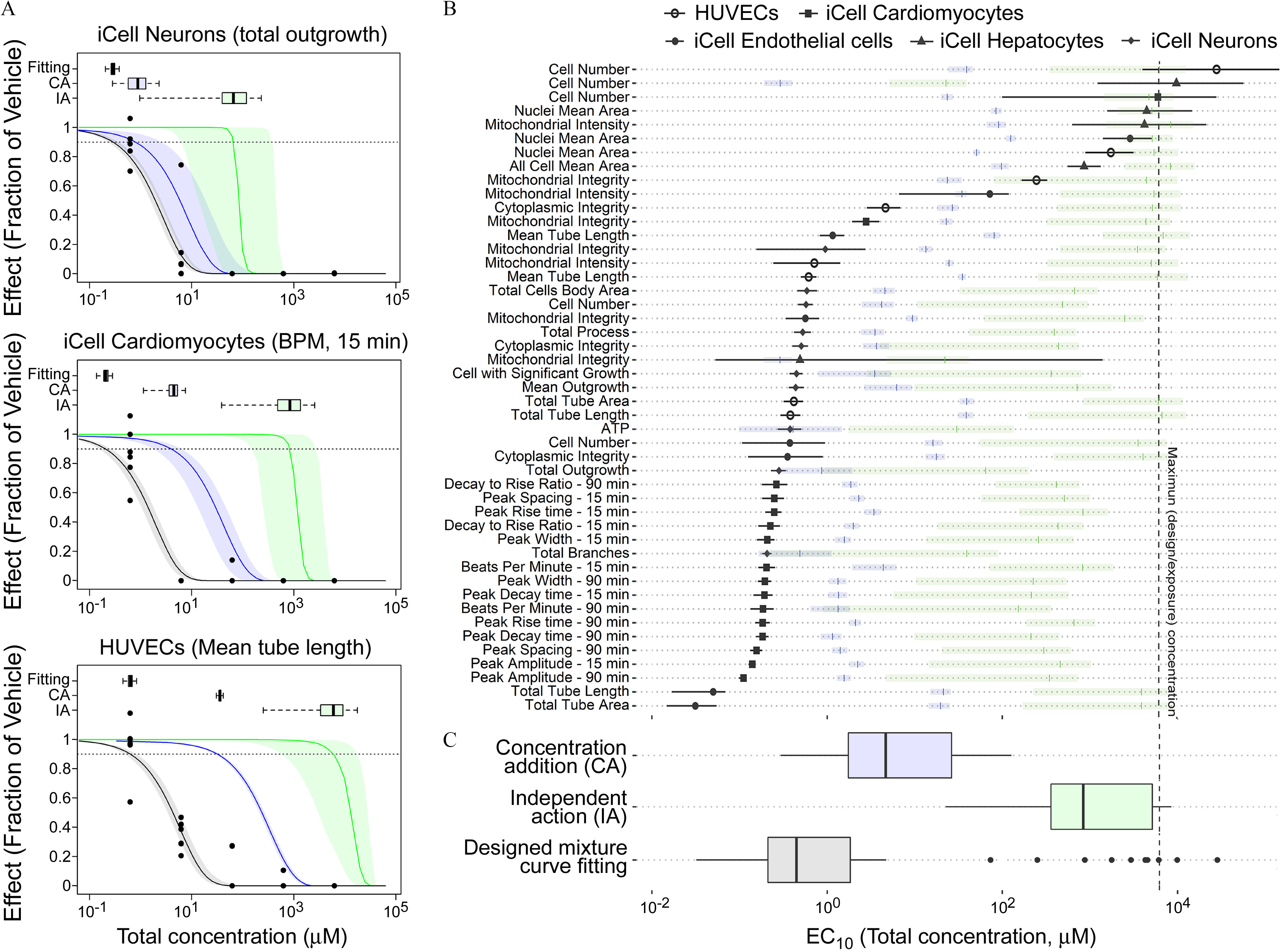
Comparison of curve-fitting, IA, and CA estimated median effective concentration () with 95% confidence limits, and each box and whisker plot shows the median, first/third quartile, and a distance of 1.5 times the IQR. (A) The representative examples to compare the concentration–response-profile for fitting and IA/CA predicted result. Box and whisker plot represents the distribution of the estimated . The points are the in vitro experimental data. (B) The comparison of estimated across all phenotypes. The shaded bars represent median and 95% confidence limits for the prediction from CA or IA (colors correspond to those in panel C) (C) Box and whisker plots summary of the estimated ; the points represent values outside 1.5 times the IQR. All data are included in a Supplemental Excel file. Note: CA, concentration addition; IA, independent addition; IQR, interquartile range.