. 2020 Dec 18;9:e62208. doi: 10.7554/eLife.62208

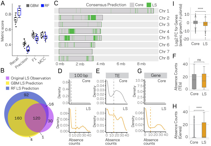
Figure 6. Machine learning predictions for genome-wide LS content.

(A) Two machine learning algorithms, Stochastic Gradient Boosting (GBM) and Random Forest (RF), were used to predict Lineage-Specific (LS) regions from 15 independent training-test splits (80/20). Classifier performance was measured for each of the 15 trials, and summarized as a boxplot with each trial represented as a point. (B) Venn diagram showing the overlap between the results of the two classifiers and the original observations of LS regions (de Jonge et al., 2013; Faino et al., 2016). Each slice of the diagram shows the number of LS regions predicted, see Materials and methods for additional details. (C) Schematic representation of the eight chromosomes (labeled on right) of V. dahliae strain JR2. Core (gray) and LS (green) classification for 10 kb windows. The consensus predictions were those made by both the GBM and RF model (in total 280). (D) Boxplot showing a significant difference for in planta gene induction between core and LS genes, Mann-Whitney U test p-value=1.34e-50. (E) Density distribution for core (gray) and LS (orange) elements based on absence counts over 100 bp windows. The mean absence counts are shown as a dashed vertical line. (F) Similar to E but the analysis was conducted for TEs. (G) Boxplot showing no significant difference between core and LS TE elements for absence counts, Mann-Whitney U test p-value=0.92. (H) Similar to E but the analysis was conducted for genes. (I) Boxplot showing a significant difference between core and LS genes for absence counts, Mann-Whitney U test p-value=3.82e-104. ns, non-significant; **** p-value<1.00e-4.

Figure 6—source data 1. Consensus LS classification genomic regions.
Figure 6—source data 2. Gene presence and absence counts.
Figure 6—source data 3. TE presence and absence counts.

Figure 6.

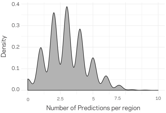
Figure 6—figure supplement 1. Density plot for the number of distribution of predictions per genomic region.

Figure 6—figure supplement 1.

The genomic data were compiled into 3611 10 kb windows. For machine learning training and testing (related to Figure 6), only 20% of the data could be used for prediction. To generate predictions genome wide, we randomly and independently split the data into training and testing (80:20) an generated predictions. Therefore, each regions could have received more than one prediction. The above distribution profile shows that a majority of the regions received three predictions, with a large proportion of the data having received between 2 and 4 predictions. Only 124 regions received no prediction by change. For each split, we ensured that the population distribution of ~20:1 (core:LS) was maintained in the training and testing data.
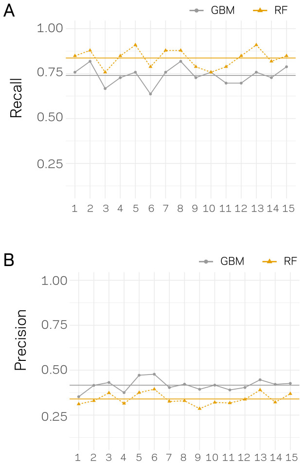
Figure 6—figure supplement 2. Recall and Precision assessment for independent classification trials.

Figure 6—figure supplement 2.

For each trail, the data set were split 80:20, training and testing, 15 independent times. For each data split, the model was trained and tested and the performance was assessed using Recall (A) and Precision (B). The x-axis’ show the data split trial. Results for each trial are shown as an orange triangle connected with a dashed line for Random Forrest (RF) based classification and a gray point for Stochastic Gradient Boosting (GBM). The mean across the 15 trials is shown by a solid horizontal line of the respective color.
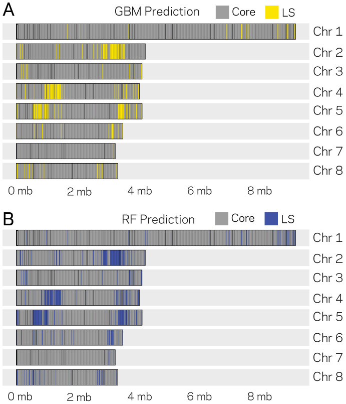
Figure 6—figure supplement 3. Genomic location of Lineage-Specific (LS) predictions from two ML models.

Figure 6—figure supplement 3.

The eight chromosomes of V. dahliae are labeled at the right (Chr. X) along with the physical DNA size indicated at the bottom. (A) GBM model predictions for 10 kb windows as either core or LS regions are shown in gray and yellow, respectively. The GBM model predicted a total of 285 LS regions. (B) RF model predictions for 10 kb windows as either core and LS regions shown are shown in gray and blue, respectively. The RF model predicted a total of 388 LS regions.
Figure 6—figure supplement 4. Size distribution and summary description of the New and Old Lineage-Specific (LS) classifications.
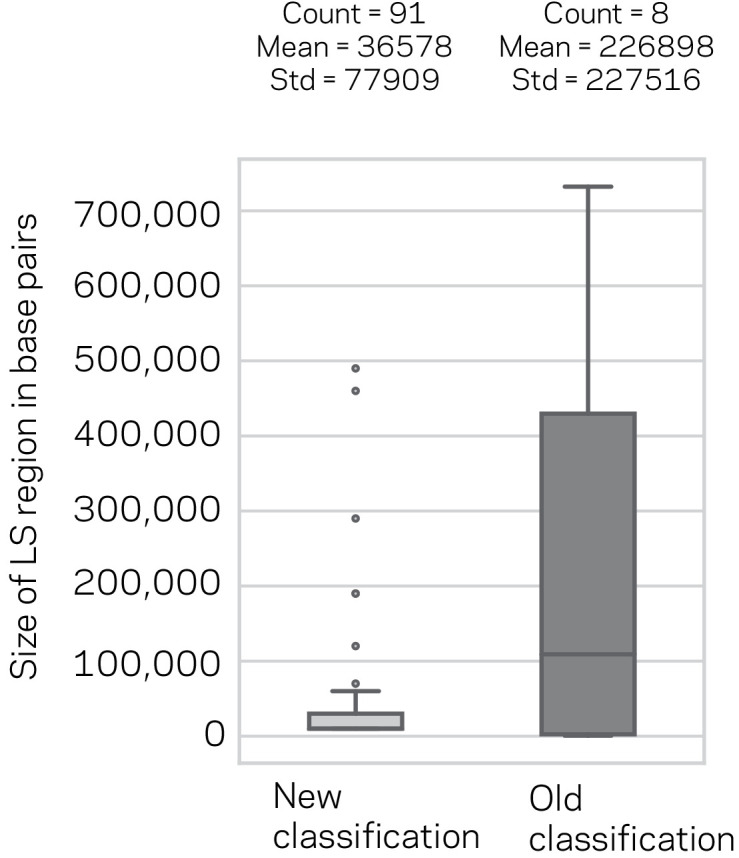
Figure 6—figure supplement 4.

Box plot of the LS region sizes for the New classification based on model consensus and the previous LS classification. The number of regions, their mean and standard deviation (Std) are shown above the respective box plots. The means were not statistically significantly different, Mann-Whitney U-Test, p-value=0.93.
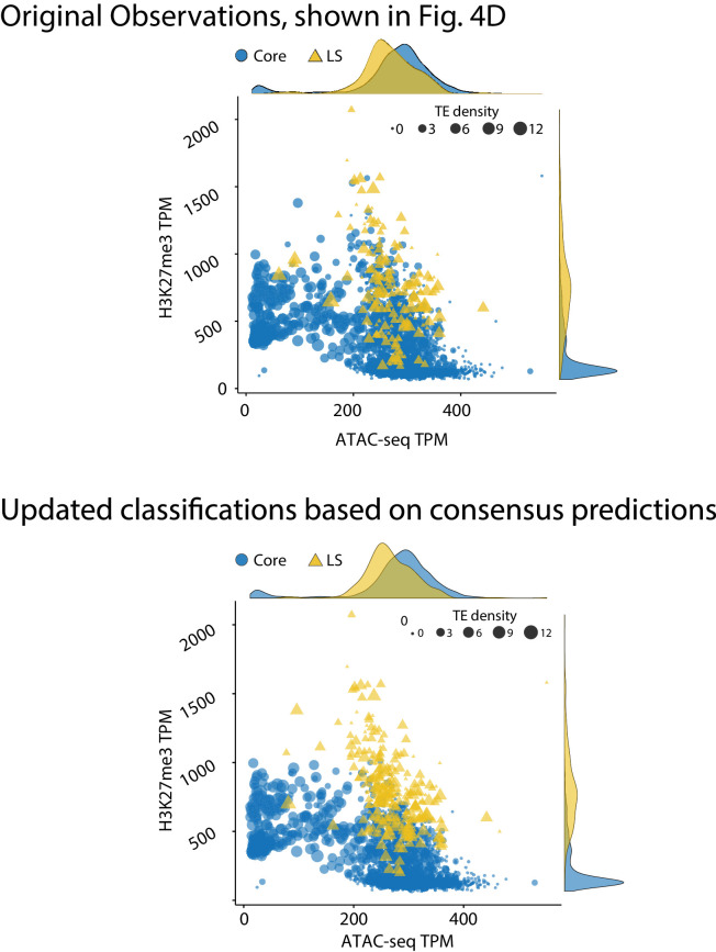
Figure 6—figure supplement 5. Genome model of core and Lineage-Specific (LS) regions defined by epigenetics and chromatin status.

Figure 6—figure supplement 5.

(Top) The genome of V. dahliae was split into 10 kb windows, and labeled as core or LS based on previous observations, shown in Figure 4D, re-shown here for comparison. (Bottom) Same 10 kb genomic windows and data, but the regions are now defined as core and LS based on the consensus machine learning predictions. The core regions are shown in blue as circles. LS regions shown as yellow triangles. Points are plotted according to TPM ATAC-seq signal (x-axis) and H3K27me3 ChIP-seq TPM (y-axis). The size of each point is proportional to the number of TEs in the 10 kb window, shown as TE density. The marginal density plots are shown opposite of the respective axis.