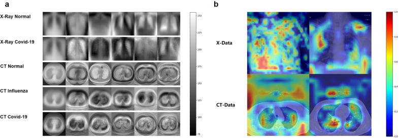
Fig. 2. PCA visualizations and example heatmaps of both X-data and CT-data.
a Mean image and eigenvectors of five different sub-data sets. The first column shows the mean image and the other columns show the eigenvectors. The first row shows the mean image and five eigenvectors of the normal CXR images; second row: COVID-19 CXR images, third row: normal CT images, fourth row: influenza CT images, last row: COVID-19 CT images. The scale bar on the right is the range of pixel values of the image data. b Heatmaps of both X-data and CT-data were demonstrated for better interpretability of the proposed frameworks. The scale bar on the right is the probability of the areas being suspected as infections.

