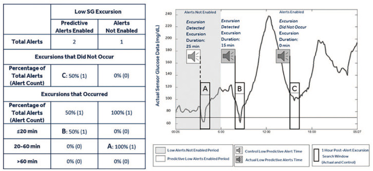
Figure 2.
Graphical representation of low predictive alerts. The table shows the number and percentage of sensor glucose alerts surrounding low sensor glucose excursions. The continuous glucose monitoring trace displays time points during periods when low threshold alerts and low predictive alerts are not enabled (gray region) and periods when low predictive alerts are enabled (white region). During the time when alerts are enabled, the alert timestamp is identified (alert graphic) and the subsequent 1-hour window (rectangular box) is queried for an excursion below the threshold. In instances where an excursion is identified, the duration of the excursion below the threshold is measured and tracked per the example table to the left (B: Excursion that occurred, while predictive alerts were enabled, and lasted ≤20 minutes). Instances when an excursion is not identified (C: Excursion that did not occur while predictive alerts were enabled) are also tallied. During the time when alerts are not enabled, the alert timestamp is identified (alert graphic) according to the CGM system’s predictive alert algorithm using the median threshold and “time before” prediction horizon of the aggregated settings of the users in the analysis. Following the control alert, the actual CGM data are investigated for the existence of an excursion within the subsequent 1-hour window. In instances following the control alert where an excursion is identified, the duration of the excursion below the threshold is measured and tracked (A: Excursion that occurred, while alerts were not enabled, and lasted 20-60 minutes). Instances when an excursion is not identified are tallied as “Excursion that did not occur.”

