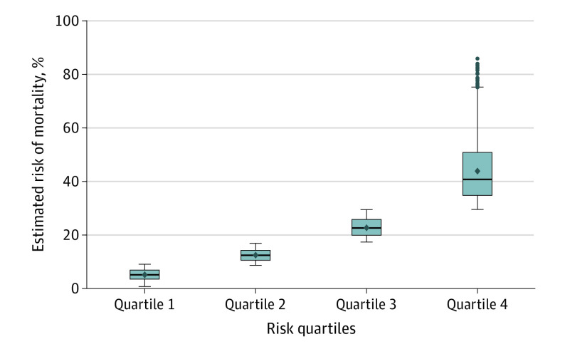
Figure 2. Stratification of 30-Day All-Cause Mortality.
The gradient of risk increases as a resident moves from higher quartiles of estimated risk. The box plot lines correspond from bottom of box to top: 25th percentile, median percentile, 75th percentile. The diamond indicates the mean. The whiskers extend to the minimum (25th percentile − 1.5 × interquartile range) and maximum (75th percentile + 1.5 × interquartile range) values. The dots indicate outliers.

