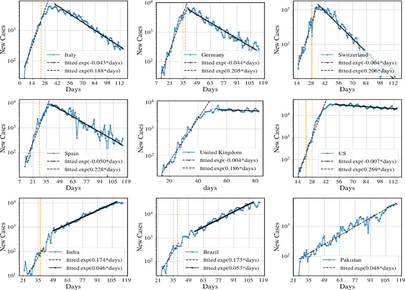
Fig. 9.
Number of new cases per day for nine different countries. The dashed orange vertical lines in some of the figures denote the day of the implementation of lockdown. We note that the first six data sets exhibits the same broad features that we see for the model predictions in Fig. 8(a,b). In particular we see the fast exponential growth and slow exponential decrease in new cases (following strong interventions). The two countries UK and US show a very slow decay rate, indicating that disease suppression has barely been achieved. The data for India, Brazil and Pakistan show the behavior corresponding to model predictions in Fig. 8(c,d) and have only been able to achieve mitigation so far (). Data from [29] and the end date is June 10. (For interpretation of the references to color in this figure legend, the reader is referred to the web version of this article.)

