Figure 3.

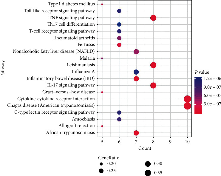
Bubble chart of top 20 pathways. Larger dots represent a larger proportion of the number of enriched genes to the total number of genes; the color gradient from blue to pink represents decreasing P values.

Bubble chart of top 20 pathways. Larger dots represent a larger proportion of the number of enriched genes to the total number of genes; the color gradient from blue to pink represents decreasing P values.