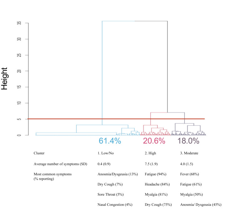
Fig. 3.
Cluster analysis of symptom presentation in the community. Symptom data were hierarchically clustered and plotted using the Ward method with the hclust and dendextend packages in R to explore patterns in patient-reported symptom presentation. The above plot of patient-reported symptoms of severe acute respiratory syndrome coronavirus 2 (SARS-CoV-2) infection with cut at height = 5 generated three symptomatic clusters. Clusters varied in mean (SD) number of symptoms as well as specific symptom prevalence. The top four most frequently reported symptoms are listed. Frequency of other symptoms in each cluster are listed in the Supplementary material (Table S1).

