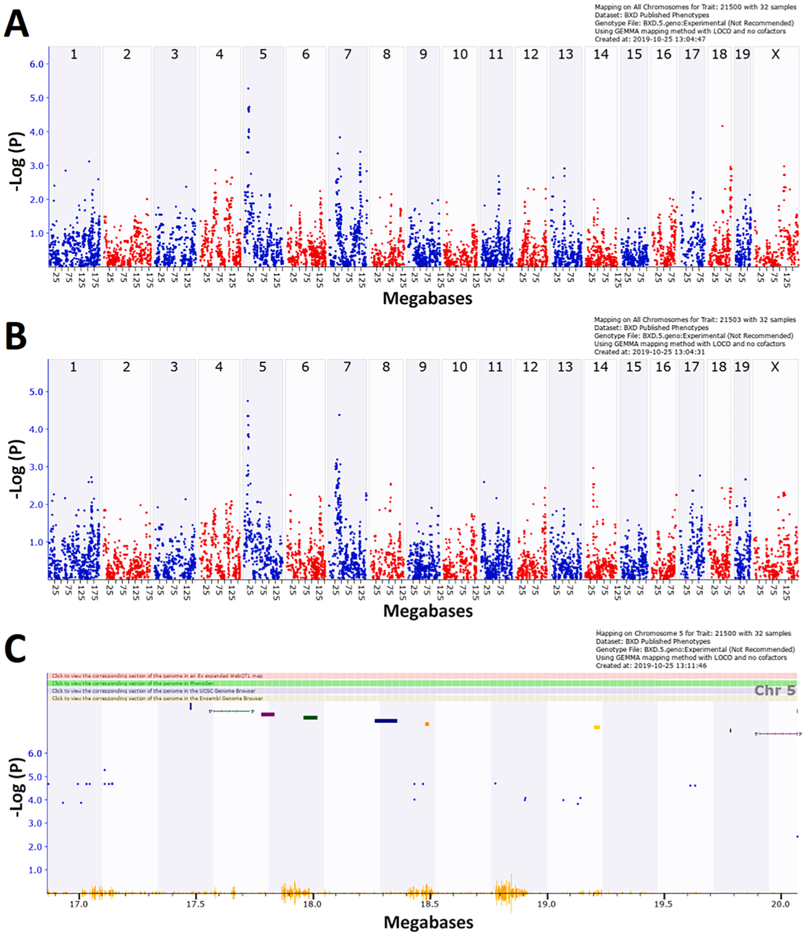
Fig. 8.

QTL mapping of difference in cell proportions between CORT + DFP treated and control animals for (A) myelinating oligodendrocytes (MOs), (B) eigentrait of all six cell types. (C) 1.5 LOD drop confidence interval of Chr 5 QTL. All figures were produced in GeneNetwork, using GEMMA. Each blue or red dot represents the −log(p) at a specific marker. In (C) bars at the top of the figure represent the location of genes. The orange ‘waves’ at the bottom of the figure represent SNP density.
