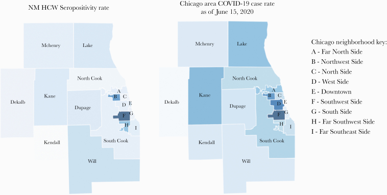
Figure 3.
Heat map of Chicago neighborhoods and surrounding counties by seropositive rate for NM HCW and Chicagoland COVID-19 case rate data. Range of % positive IgG across neighborhoods is on the left. COVID-19 case rates from the Illinois Department of Public Health as of June 15, 2020, is on the right. Darker colors represent higher IgG/case % rates, and lighter represent lower IgG/case + rates. Abbreviations: COVID-19, coronavirus disease 2019; IgG, immunoglobulin G; NM HCW, Northwestern Medicine health care worker.

