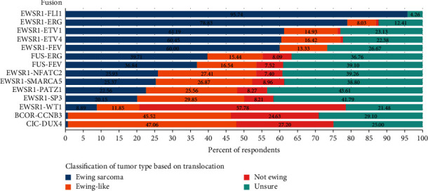
Figure 2.

Classification of variant chromosomal translocations by percentage of respondents. The data represent the percentage of respondents who believed a given translocation in the column on the left represents Ewing sarcoma (blue bar and percentage), Ewing-like sarcoma (orange bar and percentage), not Ewing sarcoma (red bar and percentage), or unsure of the classification (teal bar and percentage).
