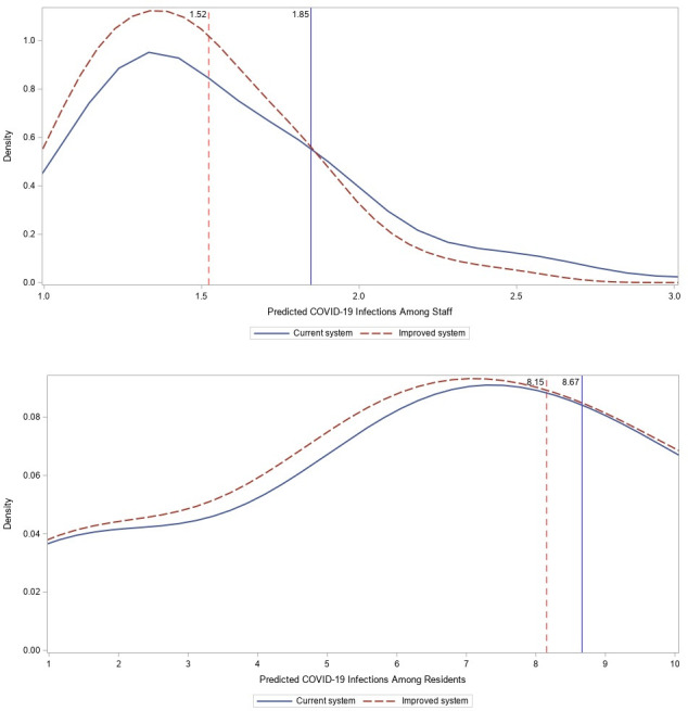
Figure 1.

Impact of improved rating system on infection density curves. Note: the blue (solid) curve represents the density of predicted number of infections under current rating system while the red (dashed) curve shows the density of counterfactual number of infections had there been no discrepancy between self-reported and CMS-reported ratings. The vertical blue and red lines show the average number of predicted infections with and without discrepancy in ratings.
