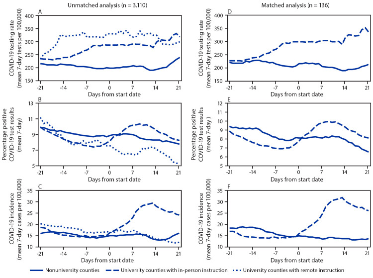
FIGURE.
Trends* in COVID-19 testing rates (A, D), percentage test positivity (B, E), and incidence (C, F) for unmatched U.S. counties† and counties matched§ based on population size and geographic proximity, 7-day moving average — United States, 2020
Abbreviation: COVID-19 = coronavirus disease 2019.
* Trends are presented relative to the start date for fall 2020 classes for counties with large colleges and universities (university counties) and the assigned start date for nonuniversity counties.
† University counties with remote (n = 22) and in-person (n = 79) instruction versus nonuniversity (n = 3,009) counties.
§ University counties with in-person instruction versus nonuniversity counties (68 matched pairs). Matches for each in-person university county were identified by listing all candidate (county) matches without large colleges or universities that had a similar population size (± 30%) and that were located within 500 miles (805 km) of each university county. From these candidate matches, the final match was selected based on closest proximity such that no nonuniversity county was matched more than once. After matching, the average distance between counties in matched in-person university county and nonuniversity county pairs was 114 miles (183 km) with a maximum distance of 471 miles (758 km). Eleven in-person university counties were excluded from the matched analysis because there were no candidate matches meeting population size and proximity specifications. All remote university counties were excluded from the matched analysis because there was an insufficient number of nonuniversity county matches.

